The art of color in interior design (Part 1)
.png)
Understanding color theory
Color is one of the most powerful tools in interior design. It can energize a room, calm the mind and highlight architectural features. In other cases it can completely transform the way a space feels — without changing a single piece of furniture.
Yet, color is often where homeowners feel the most overwhelmed. I hope this post will simplify color theory and the psychology behind color. In the next post I'll give you practical ways to build a cohesive color palette for your home. Let's begin!
1. The basics
- Primary colors: Red, Blue, Yellow
- Secondary colors: Green, Orange, Purple
- Tertiary colors: A mix of primary + secondary
.png)
From there we create color schemes:
- Monochromatic: Variations of one color (soft, layered, calming)
- Analogous: Colors next to each other on the wheel (harmonious and easy)
- Complementary: Opposites on the wheel (dynamic and high contrast)

In interior design we rarely use pure, saturated colors. Instead, we work with muted, grayed and tonal variations — which is what makes a space feel elevated a.k.a well designed.
2. The psychology of color
Color affects mood more than we realize. Here are some examples of how different colors behave in a space:
Blues - Calming, grounding, restful.
Great for bedrooms, offices, kitchens, bathrooms.
.png)
.png)
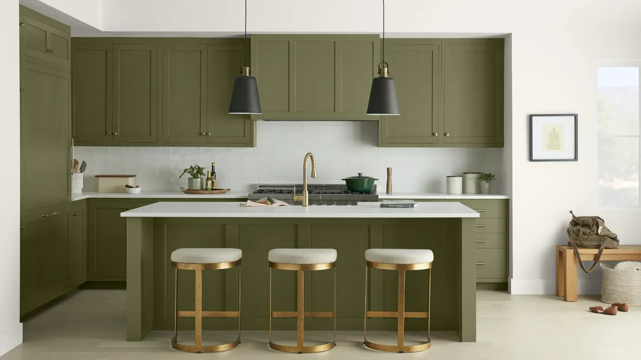
Greens - Balanced, fresh, connected to nature.
Beautiful in kitchens, family rooms, or anywhere you want quiet energy.
.png)
Warm Neutrals (beige, taupe, warm whites) - Inviting and comforting
Perfect for open-plan homes where cohesion matters.
.png)
Earthy Reds & Terracottas - Warmth, richness, intimacy
Lovely in dining rooms or powder rooms.
.png)
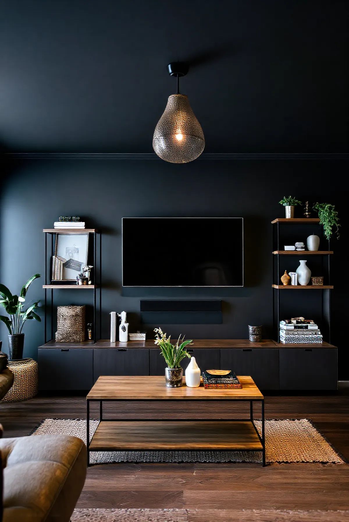
Deep Charcoal & Navy - Moody, dramatic, sophisticated
Stunning for accent walls, cabinetry or cozy dens.
.png)
Context matters. A deep blue in a sun-drenched room feels serene. The same blue in a dark north-facing room can feel heavy. Lighting changes everything. When we choose colors intentionally it creates rhythm, movement and emotion within a space. It guides the eye and softens architecture. It creates a story.
In Part 2 I'll show you how to apply what we've learned so far to various rooms within your home and common mistakes.
.png)